
The Emotional Language of Hues
Colors play a profound role in my artistic practice and in our everyday lives. They influence our perception, evoke emotions, create moods, and convey powerful messages. Each color carries its own unique symbolism and psychological impact. In this post, I’d like to share an overview of the most commonly used colors and their meanings, along with insights from my personal journey as an artist.
Red – Stimulates Appetite and Passion
Red symbolizes passion and strong emotions. It can represent both positive and negative feelings: love and romance on one hand, but also hate, anger, aggression, or obsession on the other. In painting, red brings dynamism and vitality to a composition.
As a signal color, it warns of danger or alerts us — think fire and blood. Yet it also stands for energy and happiness. It’s no coincidence that so many food products use red packaging: red has a well-known appetite-stimulating effect that marketing teams have long exploited.
Blue – Boosts Creativity
Blue is one of my absolute favorite colors, one I love using in both paintings and ceramics. It carries many meanings: people wearing blue are often perceived as cool and distant, yet the color also conveys credibility, reliability, harmony, trust, and friendliness. Blue creates an atmosphere of calm and serenity while symbolizing longing and, interestingly, enhancing creativity. Many people find it soothing — it can even lower your pulse.
Yellow – Creates Good Mood
Yellow symbolizes optimism, communication, warmth, joy of life, and positivity. However, depending on context, it can also evoke naivety, envy, greed, selfishness, or infidelity. Its brightness and luminosity sometimes link it to luxury and wealth.
Orange – Warns of Dangers
Orange represents sociability, cheerfulness, trust, energy, excitement, and warmth. Its bright tone makes it an excellent warning color, frequently used in safety and hazard signage to draw attention.
Green – Gives Us Hope
Green evokes many positive associations: relaxation, naturalness, connection to nature, balance, hope, freshness, spring, health, and youth. It is often linked to new beginnings. In some Anglo-Saxon contexts, however, it can also carry negative connotations like envy and greed.
Pink – Makes Us Feel Secure
Pink symbolizes femininity and romance. It is often perceived as delicate, somewhat distant, and soft. Historically in Europe, the gender-color associations were reversed: pink was once considered a boy’s color, while blue was for girls. Pink has a notable calming effect and can help reduce anxiety, creating feelings of safety and comfort.
Violet – Stands for Fantasy and Spirituality
Violet represents extravagance, luxury, elegance, and sometimes vanity. It is also the color of creativity, fantasy, magic, ambiguity, sensitivity, sexuality, and spirituality.
Brown – Conveys Groundedness
Brown is the color of earth and nature. It stands for restraint, humility, naturalness, regeneration, and comfort. Often perceived as cozy and warm, it can sometimes feel old-fashioned.
White – Symbolizes Peace
White traditionally represents purity and innocence, as well as peace (think white doves or white flags). It also conveys freedom, simplicity, neutrality, clarity, and openness, while sometimes evoking emptiness. White light is the sum of all colors.
Grey – Objective and Functional
Grey is associated with indifference, conformity, modesty, emptiness, and sadness. Like white, it conveys objectivity and functionality, though it can also appear poor or dirty in certain contexts.
Black – Timeless Elegance
Black is a powerful color symbolizing strength, power, mystery, and timeless elegance. In our culture it is often linked to mourning and death, and it can evoke loneliness or create strong contrast and separation. It can also express modernity or conservatism.
Gold and Silver – Luxury and Quality
Gold stands for true luxury, wealth, status, power, honor, and happiness. It creates a warm, radiant atmosphere. Silver is associated with coolness and distance but also with high quality, elegance, technological progress, and modern design.
Using Colors Consciously
Understanding color psychology allows us to use hues intentionally to enrich visual communication and enhance well-being. Cultural differences matter greatly — for example, white symbolizes purity in many Western cultures but mourning and death in some Asian cultures. Gender perceptions of color are also shifting, with brands increasingly moving away from traditional “male” and “female” colors.
The Fascinating History of Pigments
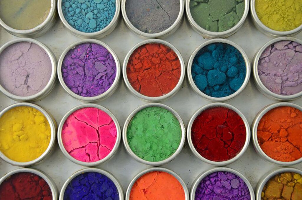
Since humans first painted animals on cave walls with Ochre, charcoal, and chalk around 40,000 years ago, colors have held both symbolic and technological importance. Red Ochre was likely the first pigment used. Many natural pigments have surprisingly toxic histories (mercury, lead, arsenic), while others like Tyrian purple or Ultramarine from lapis lazuli were extremely rare and expensive, becoming symbols of wealth and power.
The chemical revolution brought synthetic pigments such as Prussian Blue (1706), synthetic Ultramarine, and Alizarin, making vibrant colors more accessible to artists.
My Love for Blue
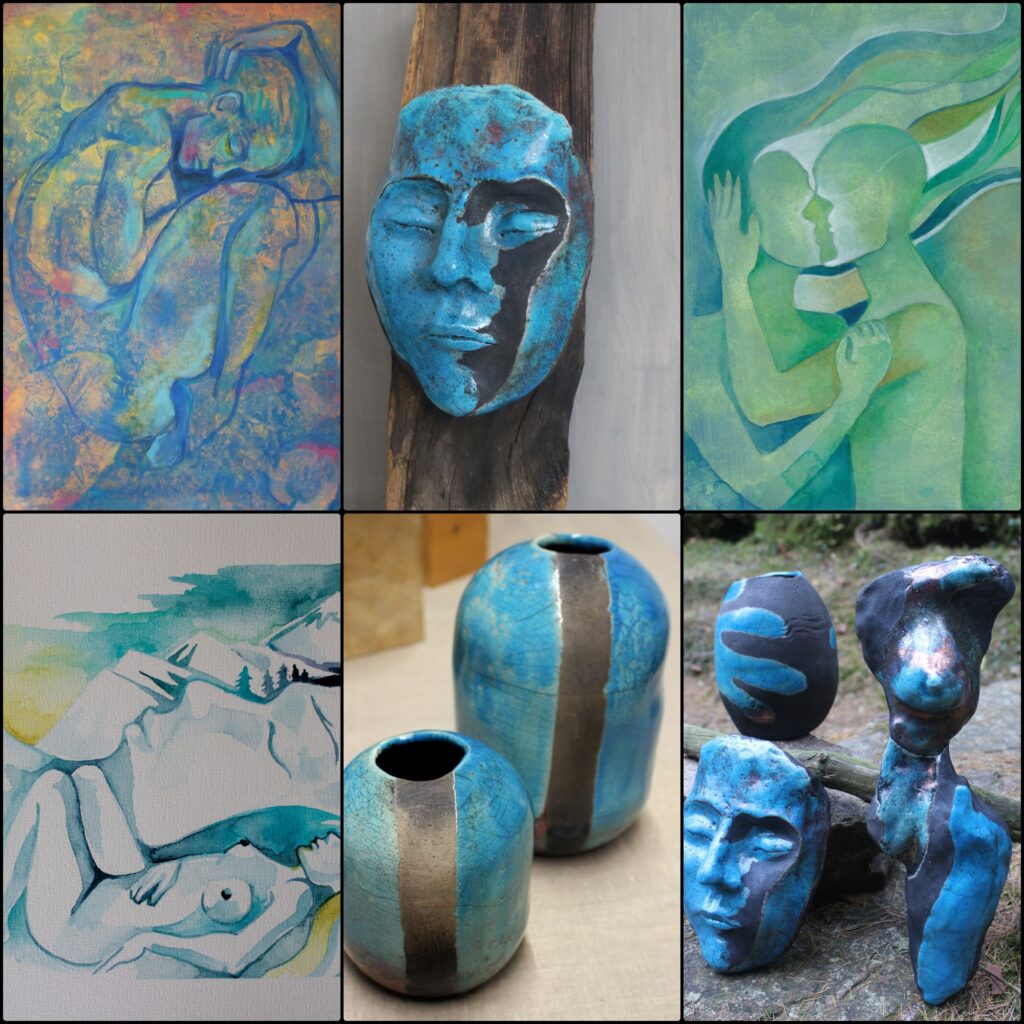
I work a lot with figurative art and find blue incredibly attractive and important. Inspired by ancient Egyptian pigments, I often use glazes with higher amounts of cobalt oxide and copper in ceramics. In painting, I favor turquoise and marine blue in acrylics, watercolors, and oils.
For me, blue symbolizes calm, balance, depth, air, freedom, connection, and relaxation. It shines beautifully when combined with yellow, green, or red. Many great artists — Picasso, Renoir, Monet — made blue a central element in their work. Turquoise and deep marine blue remind me of water in all its forms and represent transformation and change.
Colors and Music
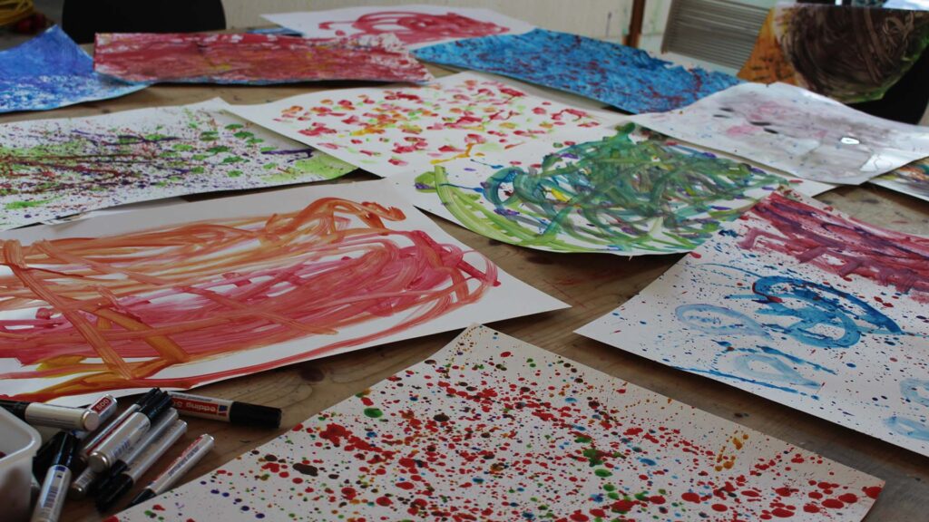
In my workshop “Painting with Music,” I explored how music influences the creative process and color choices. Energetic, loud music often led participants to use lots of red, while calm music inspired more blue tones. Each piece of music has its own character — just like the colorful, layered results on paper.
Final Thoughts
Colors are incredibly powerful. They enrich our lives, tell stories, and shape our emotional states. I feel deeply grateful for the gift of color perception and the ability to express myself through it in my art.
What’s your relationship with colors? Which hue speaks to you the most? Feel free to share in the comments below.
— Polina Alaska